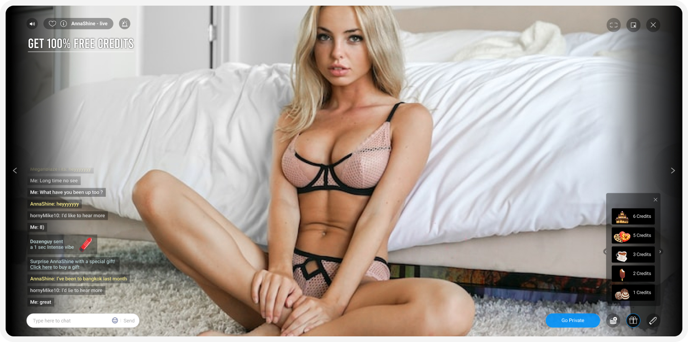
ImLive.com, adult live webcam
Find the eye candy of your choice, chat & get intimate
2019 - Ux & Lead designer
Project Overview
ImLive.com, active for more than 17 years, is among the top online adult entertainment broadcasting platforms.
being active for this extended period of time, in a highly competitive market, created a need to update, refresh and unify the platform's design style and UI.
Let’s talk about the elephant in the room
Some find ethical issues with the webcamming industry, thoughts about exploiting women, supporting a diminishing industry, and more... As a designer working for both types of end users (models and paying users), at imlive we made the extra effort of giving the models a safe, manageable, rewarding & empowering diverse ecosystem, keeping them as their own boss and in control. Models always have the option to continue to a different career without worrying about their footprint on imlive.
Work in process
The task at hand had more then a few objectivs to improve: Site navigation, in house campaign visabilty, models browsing exprience, live stream players, and list goes on..
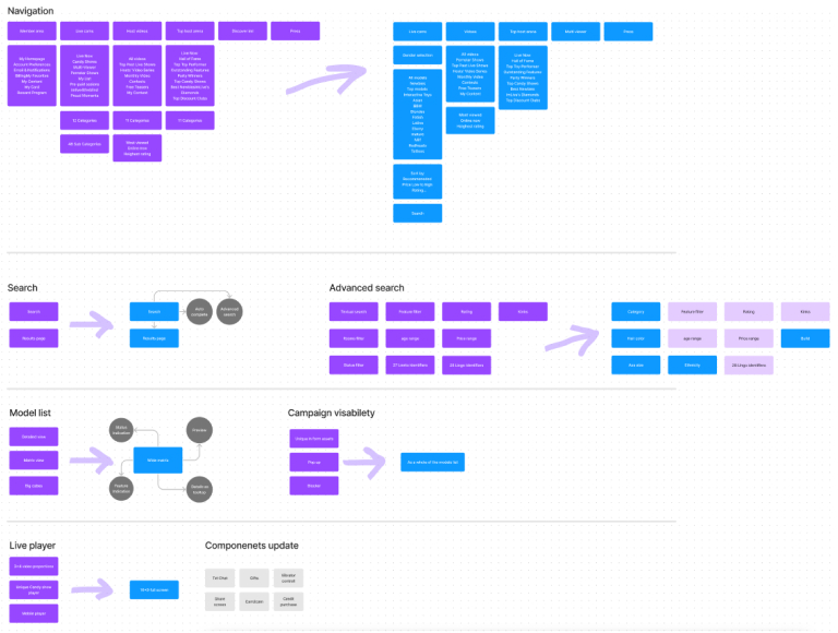
We created a high-level scheme, mapping the pages, features and elements, that needed attention. Detailing how and what to improve, prioritizing the weakest points of the main user interaction site areas.
Site navigation
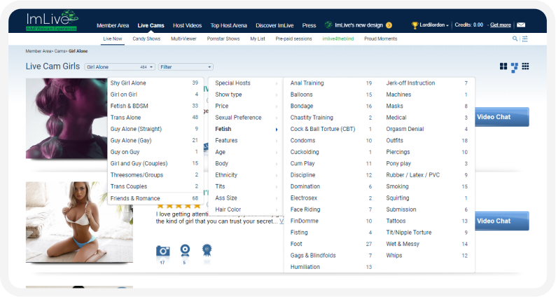
Previous navigation was built in a quite complex hierarchy, where the user had to choose the experience and only then dazzle with somewhat vague categories and a big bunch of filters.
this method was clumsy and for sure not easy to go around for new users.
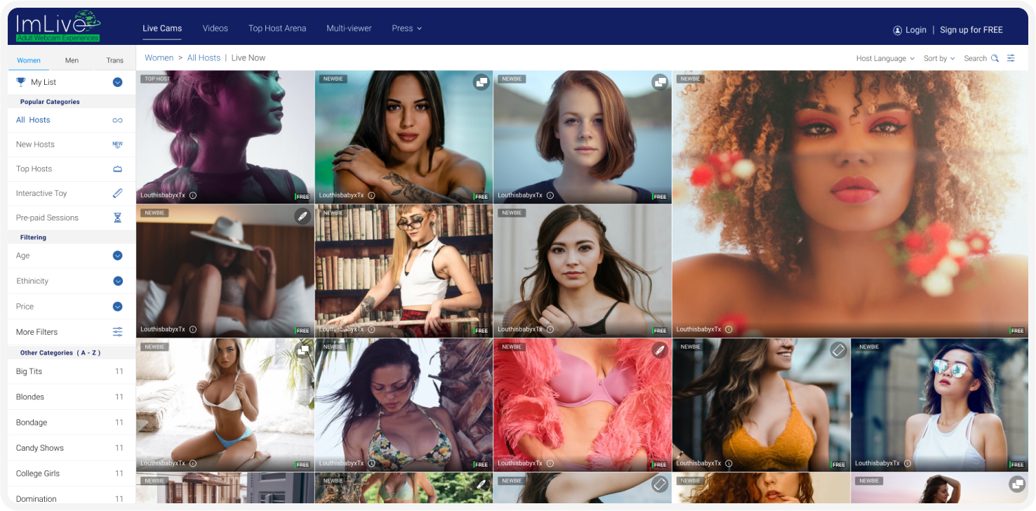
We simplified the main nav and moved to conventional side navigation containing the user's favorite models, recent visits, following popular categories, feature selection, and categories listed by ‘ABC’ order.
Searching
Outdated site search can be a major point of frustration for the user. Instead of continuing their search on your site, they’ll likely end up bouncing off the page.
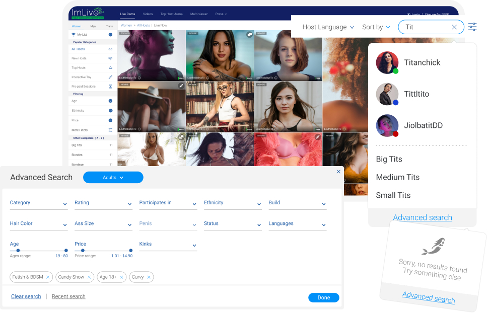
Our search model is empowered with suggested results, showing the model's name and profile image or a relevant category. Plus an advanced search for ones with unique demands.
Finding the desired partner
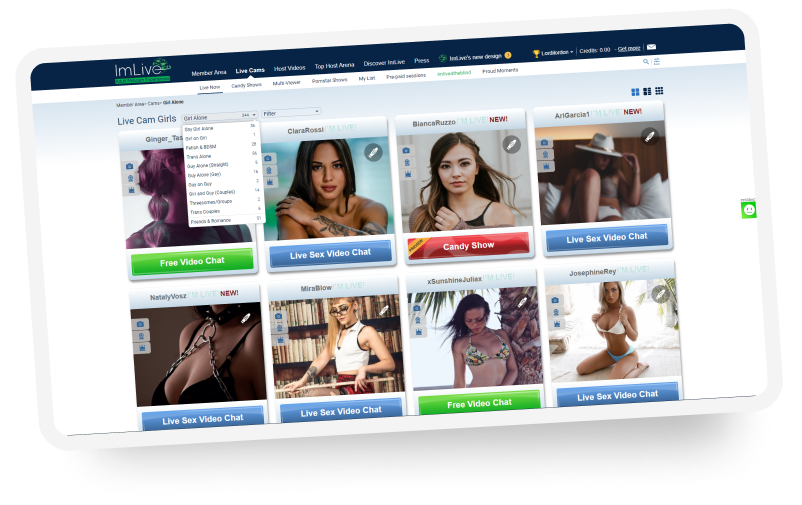
After one reaches his preffred categotry or model list, he has to browse over abundance of profiles.
Previously we supported three diffrent list view types
each support a diffrent mental model.
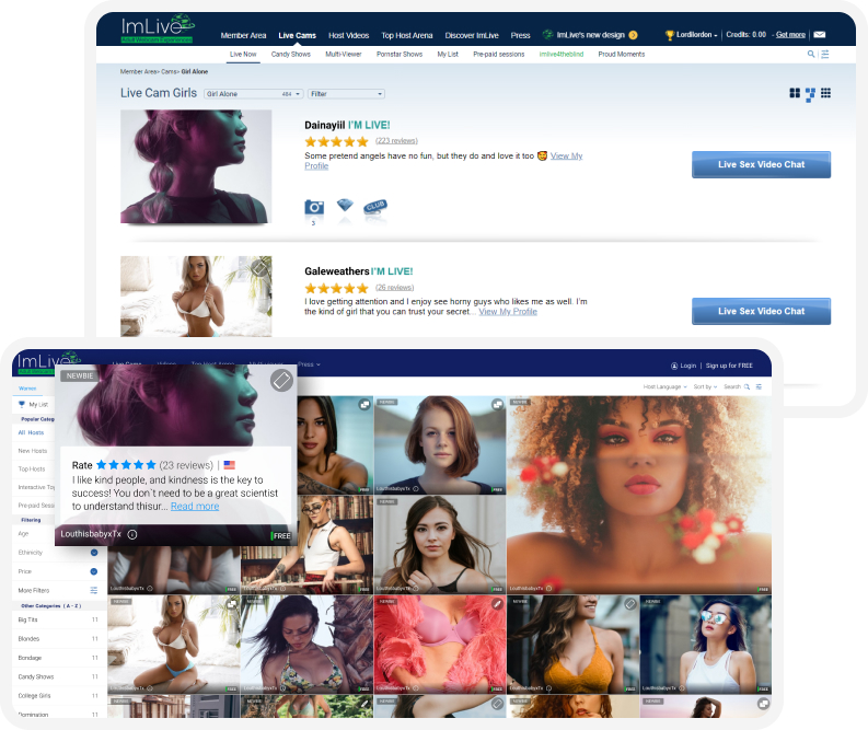
To make this experience more fluent, the amount of information was reduced, keeping reducing cognitive overload and focusing on the model.
We got our customer support team to run a small questionnaire among the veteran users, to get what are the key features that they use to go around the site.
The answer was solid enough to count on. those users like to get the models' personal descriptions aside an image or teaser video, it gave them a deeper, more personal sense of the person behind a sexy photo. a thing that non of our competitors had.
Dealing with banner blindness
"Users have learned to ignore content that resembles ads, is close to ads, or appears in locations traditionally dedicated to ads."
Kara Pernice - nngroup.com
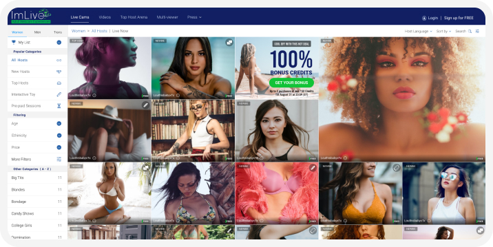
Part of the site conversion and retention tools relays on banners. we had them intergrated within the model list and look as less destrictive but still noticable.
Video chatting
Users get in the chat room after picking their preferred model or directly from a 3rd party link. either way this is the place where they are most likely to convert or spend money. and most of it is up to the model
the UI is placing the model with 100% focus, trying to give the user a sense of intimacy with the model. The main features are visually grouped and positioned in key areas on each corner of the screen.
